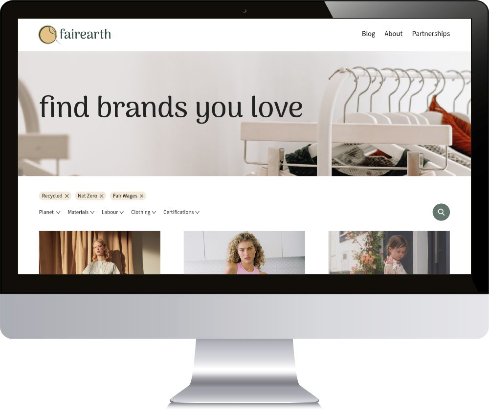



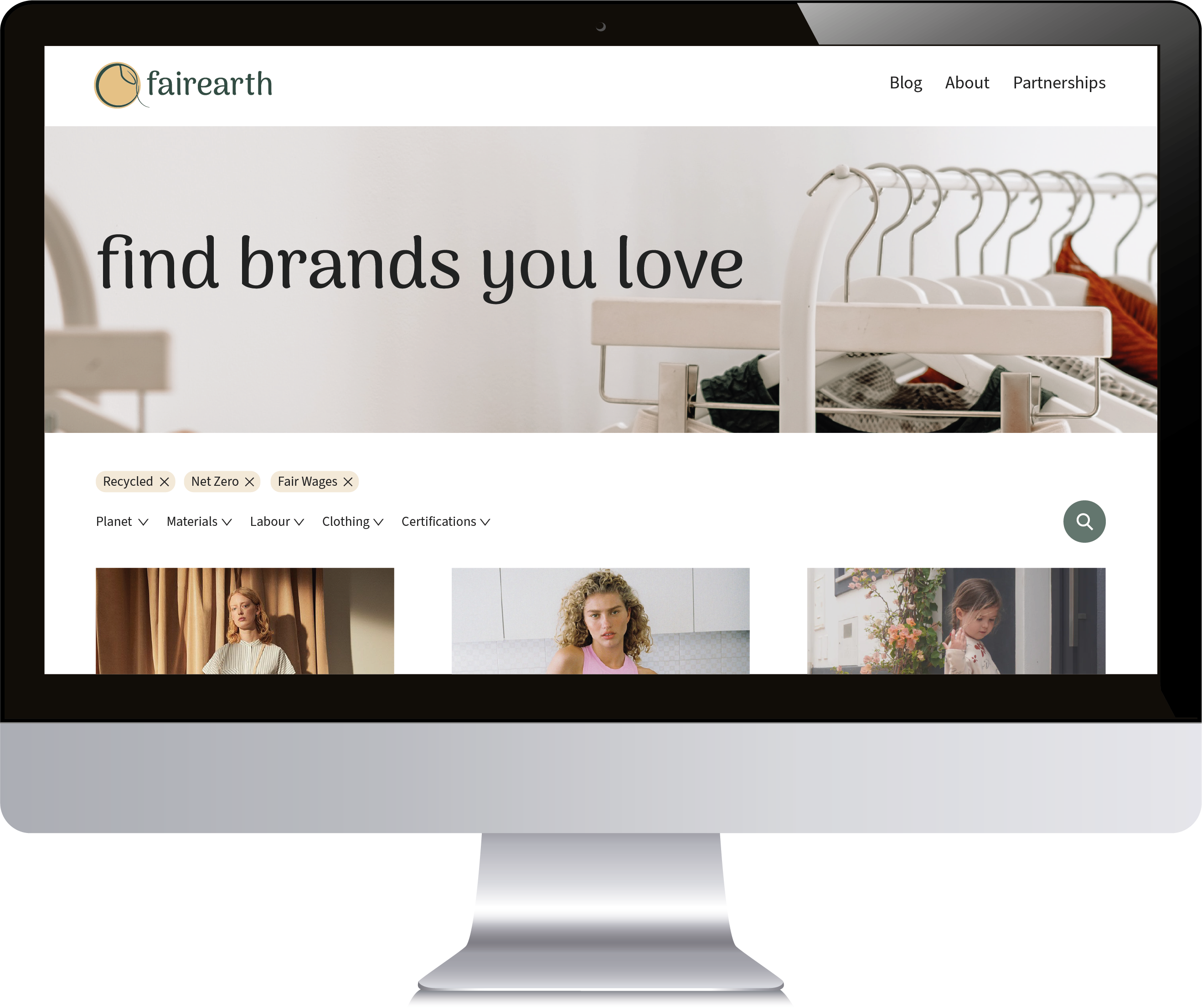






The purpose of this design artifact is to show that I am capable of doing a website redesign showcasing my capabilities in High Fidelity Prototyping. The audience of this design artifact is people interested in my website design capabilities and processes. Real-world users are people interested in finding new brands that align with their values. This artifact needs to show I created an efficient redesign of the Fairearth website across web and mobile platforms. I used a mockup only containing the web mockup as I haven’t finished the mobile one yet. The mockup communicates how the redesigned Fairearth website looks across the web platform.

The overall concept for this design artifact is a redesign of a company’s website. This redesign meets consumers’ needs by including the main purpose of the website on the landing page – filtering and looking through potential brands to buy from. I also included a redesign of the brand profile page (as seen by clicking COS) which is the second most important part of the website. The redesign meets potential client’s needs by showing I can redesign a website and focus on the primary functionality that must be performed. I also regularly considered a consumer’s perspective whilst designing. I used the principles/elements of repetition, harmony, and hierarchy. Repetition and harmony are achieved by showing a consistent layout of elements through the brand pages on the landing, profile pages, and using a consistent color scheme across all pages. This unifies the company’s brand identity. The top of each page has a header image that engages the user visually with plant and clothing imagery.

A unique aspect of this design artifact is the interactive High Fidelity Prototype I created to accompany it. This design artifact shows that I can create a new look for a website that otherwise had no design elements before. In the interactive prototype, I have separate artboards to show the main components and design elements that I used. Lastly, it shows my skills in using Adobe XD and prototyping capabilities.

An improvement to this website redesign would be to create the Blog page/posts and create the mobile redesign (which I’m working on now). Another improvement is adding the functionality to select from the dropdown menu and remove the filtering options within the prototype. I could also update all the filtering options from the drop-down menu to its respective name instead of repeating the component text. It is tedious work but will make the prototype come even more to life.


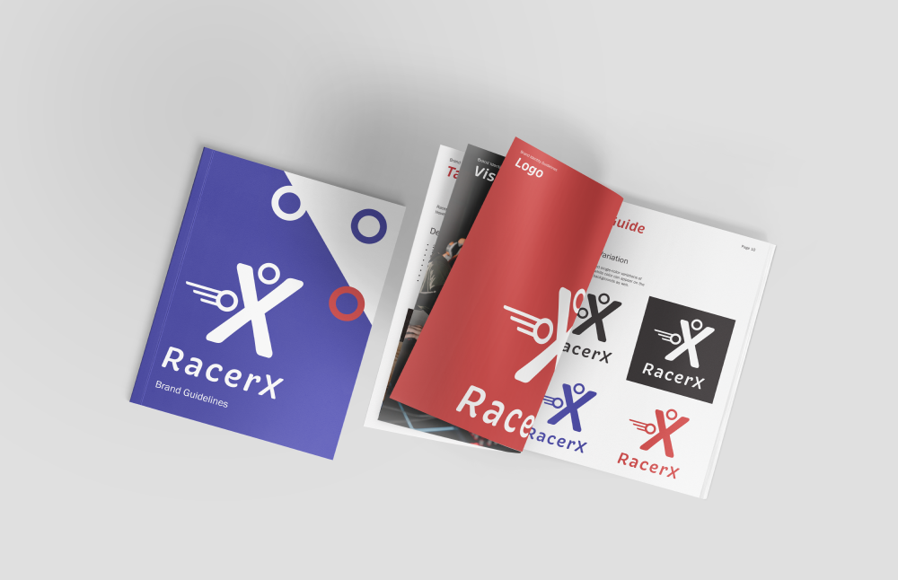
The purpose of this design artifact is to show that I understand how to create Brand Identity Guidelines. The audience of this design artifact is people interested in my branding experience. Real-world users are workers at RacerX who create brand content. This artifact needs to show I created a unique brand concept for RacerX. I used a magazine mockup and showed various pages of the logo guide. The brand guidelines communicate the company’s personality, mission, tone of voice, and usage guidelines for all visual elements, such as logos, imagery, and patterns.

The overall concept for this design artifact is a gaming company’s brand identity guidelines. The company’s designers and employees will look to it when making design decisions such as website design, magazine advertising, or business cards. This design meets my audiences’ needs by communicating RacerX’s brand identity. The mockup shows that this design is meant to be viewed physically and flipped through. I used the principles/elements of contrast and repetition. The contrast is shown through colors (red vs blue), typography (fun vs formal), and scale of the elements. Repetition is achieved through the consistent spacing between headers/content, imagery, pattern placement, and layout.

Some unique aspects of this design artifact are the unique cover and each section has an eye-catching cover. This design artifact shows that I am aware of what goes into brand identity, how to research competitors, and what sections are necessary to consider for the guidelines.

An improvement to these guidelines would be either making a digital version or updating the current to reflect a standard magazine size/layout. The current working document is not on facing pages, so there needs to be more consideration for items placed near the gutter. The paging should also be updated as it doesn’t fit a magazine format. These updates will make my design better when viewed in a magazine. Considering a digital layout will make this a better viewing experience on the web too.


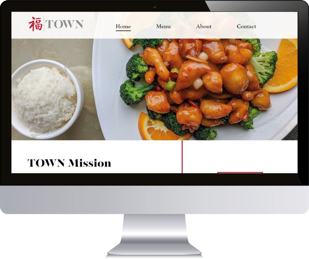
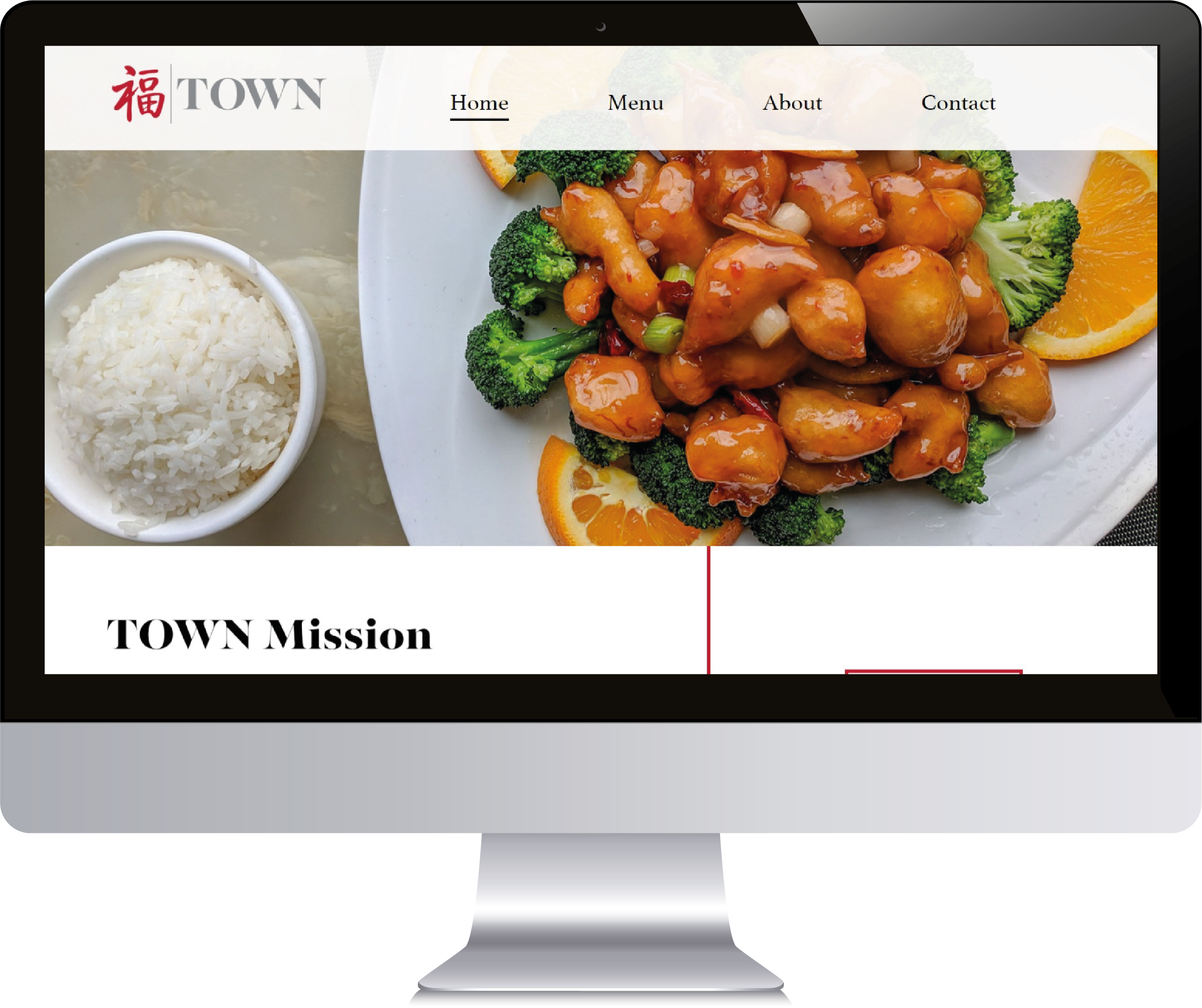
The purpose of this design artifact is to show the final website design I created at town-restaurant-nyc.netlify.app. The audience of this design artifact is people interested in my web design and programming experience. The real-world users are people interested in eating fine dining in Manhattan. This artifact should show how my design fits on a monitor and give a sense of the website’s layout, hierarchy, and style. The website should communicate the restaurant’s personality, mission, menu, and history, reaching out to more potential customers. It can also be a place where users make an online reservation.

The overall concept for this design artifact is a high-end restaurant’s website design. This design meets my audiences’ needs by communicating TOWN’s goals of making reservations and seeing the menu. The mockup shows that the design should be viewed on the computer. I used the principles/elements of hierarchy, movement, and negative space. Hierarchy is achieved through the large imagery and headers, movement is given with the red line as you move your eye downwards, and negative space allows moments for the eye to rest.

Some unique aspects of this design artifact are that I did wireframes of the concept in Adobe XD and I coded it entirely in HTML/CSS. This design artifact shows that I know how to wireframe, deploy and host a website, code in HTML/CSS, and develop a cohesive web design.

An improvement to this website is making it more responsive. The design does not consider this website on other platforms like phones and tablets. It could also be more interactive for the user. For example, when coming onto a new page, the elements could slowly fade in, or clicking a menu item photo could enlarge it into an overlay. There is plenty to improve with this artifact. These improvements will make a better user experience for visitors.


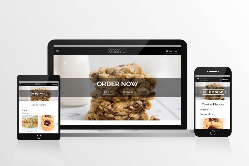
The purpose of this design artifact is to show that I am capable of doing a website redesign with an accompanying UX Case Study. The audience of this design artifact is people interested in my website design capabilities and processes. Real-world users are people interested in ordering sweet treats and the cookie menu of Goodly Cookies. This artifact needs to show I solved UX issues within the Goodly Cookies and created an efficient redesign of the website across various platforms. I used a mockup containing three platforms – computer, tablet, and mobile. The mockup communicates how the redesigned Goodly Cookies website looks across all common user platforms.

The overall concept for this design artifact is a redesign of a real company’s website. This redesign meets consumer’s needs by including an Order Now button at the top of all pages. It also makes a separation between original and seasonal cookie flavors on the home page. The redesign meets potential client’s needs by showing I can redesign a website across various platforms. I used the principles/elements of repetition, harmony, and hierarchy. Repetition and harmony are achieved by showing a consistent layout of elements (menu, header, buttons) across platforms. It creates a unified look for the company. The design’s hierarchy is established by the order and importance of elements noticed when visiting the page. For example, the Order Now banner/button with an underlying cookie image on the landing page draws immediate attention to the call-to-action of ordering cookies.

A unique aspect of this design artifact is the accompanying UX Case Study. This final design artifact shows that I can create an engaging user experience across multiple platforms. When viewing the UX Case Study to understand my process, it shows how I researched personas, thought out scenarios, created a design brief, sketched out low-fidelity prototypes, and created a final design of the Goodly Cookies website in Adobe XD.

An improvement to this website redesign would be to create an interactive prototype in Adobe XD. I could also create all the pages from the original website (I only created a redesign of three pages) and include transitions for interactive moments with the user. This would mean I need to create the pages across laptop, tablet, and mobile. I could also make short videos of the interaction with the prototype and compile a design artifact gif which shows what the user experience is like within the redesign compared to what was missing before.


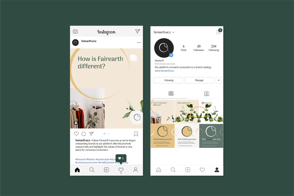
The purpose of this design artifact is to show the brand identity for Fairearth. It also shows my ability to create social media content for the brand. The audience of this design artifact is people interested in my branding capabilities. The real-world users are consumers and conscious fashion brands. The consumers are people interested in slow fashion and finding clothing brands that align with their values. Fairearth will partner with brands and display them on Fairearth’s platform where these brands will gain more exposure for their values and business practices. This artifact should show how my design fits in a social media setting and give a sense of the brand identity. The brand should communicate Fairearth’s mission, values, personality, and the visual elements such as logo and design patterns.

The overall concept for this design artifact is to promote an emerging company on social media and its brand identity. This design meets my audiences’ needs by communicating Fairearth’s goals of garnering attention to the website and having a cohesive brand identity. The mockup shows that the design should be viewed on the mobile Instagram app. I used the principles/elements of negative space, emphasis, and harmony in this design. There is negative space around the social media post and even a dimensional effect to it with the shading underneath it. This makes the post more emphasized, and our eyes draw inwards. The post circles come off the page sides which creates a harmonized effect and connects the post mockup to the surrounding empty space.

Unique aspects of this design artifact are that I did a complete branding of Fairearth and used many brand elements in this social media mockup. These elements include brandmark, color (green and gold accents), and leaf/circle visual elements of interest. This design artifact shows that I know how to create a logo, brand identity, social media post, and UX copy.

An improvement to this branding mockup is making more post examples and using a mockup that shows a variety of Fairearth social media posts promoting the brand. There are more engaging mockups that show an account’s profile, grid of posts, and stories. If I create more content, then there would be more material to work with and show how I incorporate the brand outside of a single post. The design could also be expanded to create wireframes and mockups of the website on computer and mobile using the brand guidelines. If I could explore this more, then a UX case study could be conducted to understand the critical functionalities of this emerging platform. I would gather both consumer and brand input on this part since both are necessary for this platform to succeed.


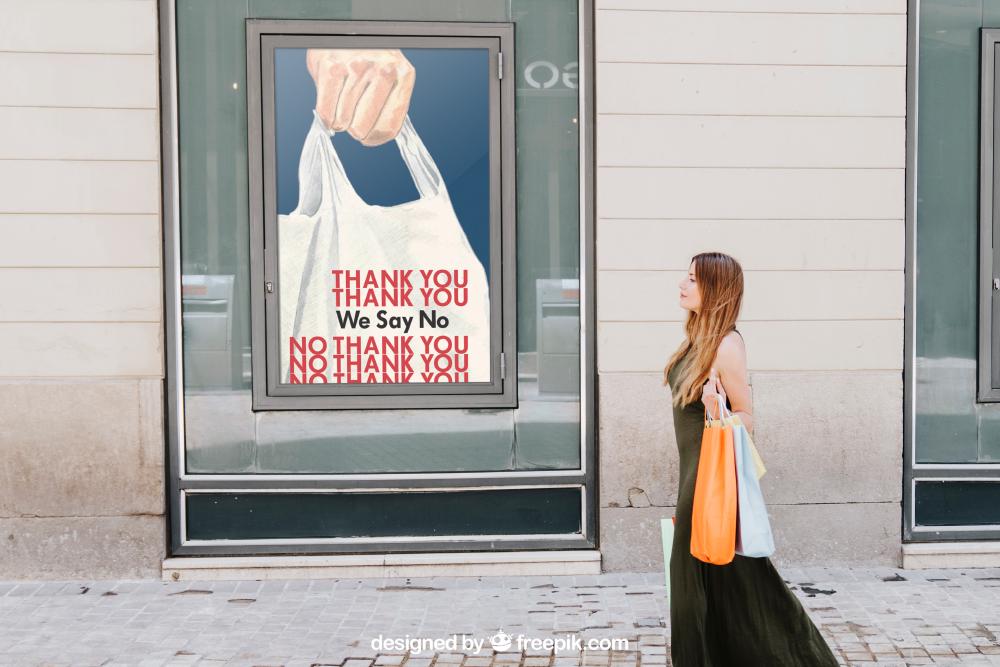
The purpose of this design artifact is to show my ability in making call-to-action posters. The audience of this design artifact is people interested in my technical skills and graphic design capabilities. The real-world users are consumers and conscious fashion brands. The consumers are people interested in sustainability and declining the use of single-use plastic bags. This artifact should show how my design fits in a printed and public setting. It also should show scalability for being a poster in the city.

The overall concept for this design artifact is to promote a call-to-action to limit single-use plastic bags. This design meets my audiences’ needs by communicating the action of refusing plastic bags with a simple “no thank you”. This plays off the common phrase seen of “thank you” on the bags. The mockup shows that the design should be viewed in public areas. Preferably near grocery stores where the usage is common. I used the principles/elements of color, balance, and repetition in this design. The bright red of the wordage jumps out to a passerby grabbing their attention immediately. The hand at the top balances out the bag and message at the bottom. Lastly, repeating the words “Thank You” creates a nostalgic feeling within someone. This poster uses that feeling and uses the repeating phrase “No Thank You” to leave a different message instead.

Unique aspects of this design artifact is the mix between a hand drawing and digital graphic elements. I scanned in a colored pencil drawing of a hand holding a plastic bag. Then I layered graphic elements on top in Photoshop. This design artifact shows my creative side and ability to incorporate a mix of different techniques to create a design.

An improvement to this call-to-action poster is revisiting the textual elements’ placement and use. There could be more integration between the text and drawing image such as adding shadowing to make the text feel more a part of the image. I would also reconsider the coloring of the “We Say No” text. There is no other instance of black and I think that black breaks the cohesion of the design slightly. I’d also reconsider the blue and background behind the hand and bag graphic. There is a potential to make a better design promoting the refusal of single-us plastic bags through revisiting of fundamental design elements.


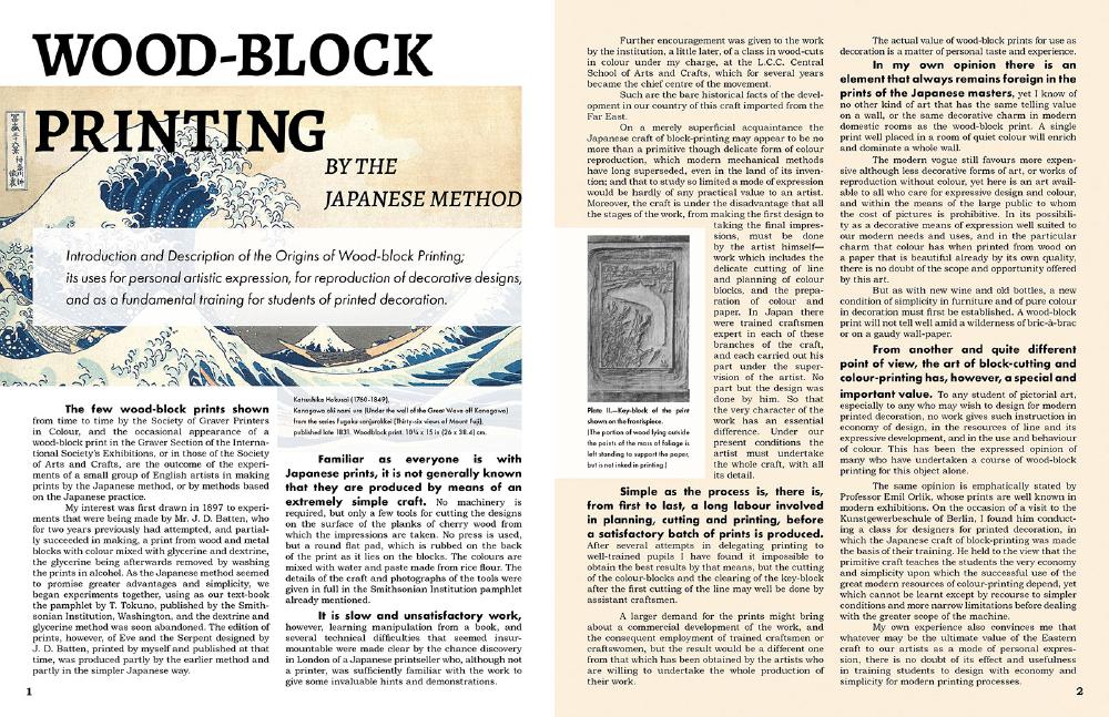
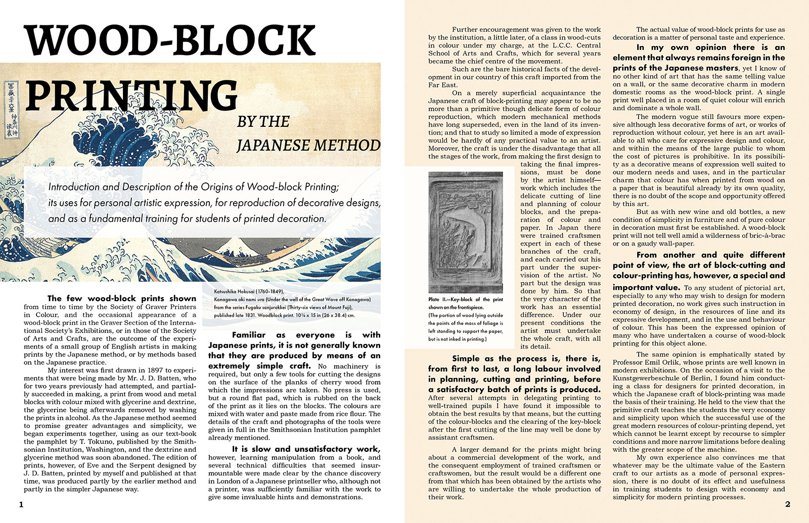
I created a two-page magazine layout for a wood-block printing article.

I layered many elements on page one over a wood-block print by Hokusai (my favorite art piece - the Great Wave of Kanagawa!). I bolded certain beginning sentences I thought provoked interest and statements that would keep the audience’s attention. I gave a slightly textured background to page two to make the layout more interesting and cohesive with the image on page one.


The purpose of this design artifact is to promote fairearth through a logo that aligns with its values.

I started by doing in depth research into their company values, mission, and goals. I created a moodboard and went over it with the client.
Once the intention behind the company was understood, I starting doing sketches of the logo. From those sketched I picked an idea that stood out the most and scanned it into Ilustrator. I showed three iterations of the design to the client and we worked through it making sure the end result was how the client envisioned.


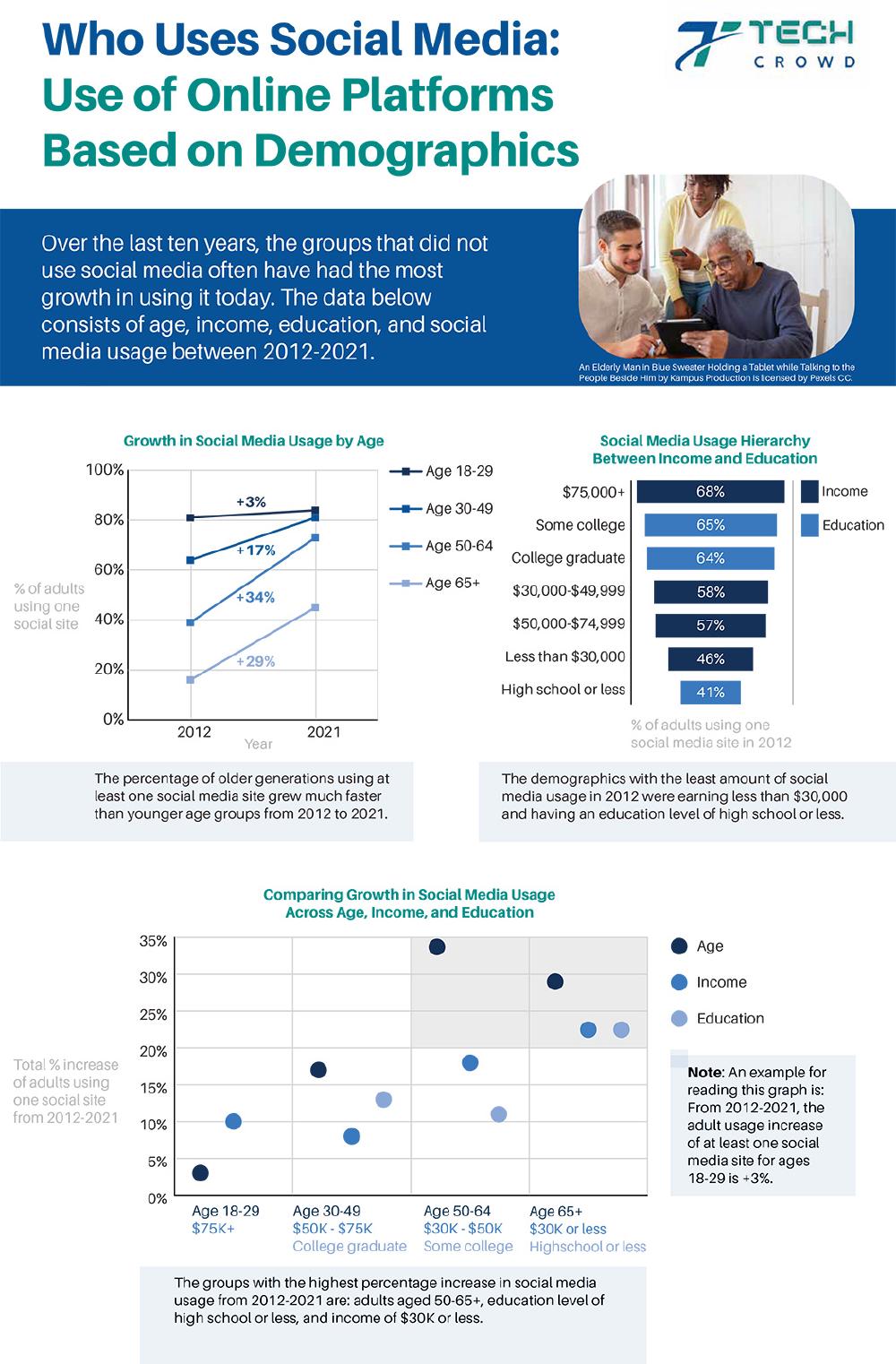
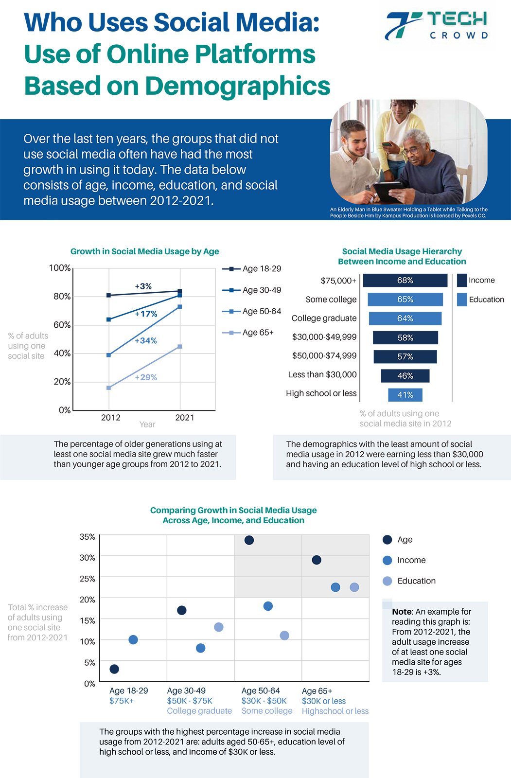
I created an infographic containing social media usage data in my Designing with Data course.

We were given a dataset of social media usage by demographic groups - age, income, and education. I came up with the data story that the groups who used social media less in 2012 have had the most growth in using it by 2021. This story is told through three different graphs made in Illustrator. Image is taken from Pexels.


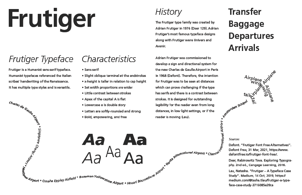
I chose Frutiger as my final project’s typeface in Typography class and completed a “Homage to Typeface” assignment.

I utilized a four-column grid, aligning sections of information within it and creating elements of visual interest. With Frutiger’s creation intended for airports, I gave this layout design a few airport elements. I included text made out of varying Frutiger font styles in the shape of a plane and its path. I also added common words seen on signs at the airport. This layout has a lot of movement and utilizes certain design elements such as negative space, contrast, emphasis, and various font styles to showcase the Frutiger type family.


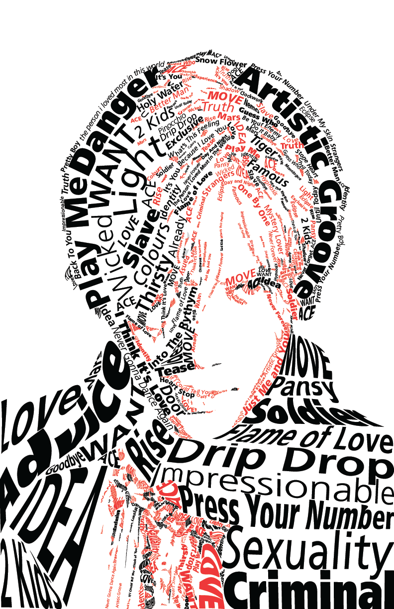
I created a typographic portrait of the Korean artist Lee Taemin using title tracks of his albums. The focus of this project was the use of typography and how to use the Frutiger type family to embody the subject.

Read more about my rationale for my design choices here.
